Friday, 31 January 2014

Aart Houtman / Henri Matisse


Henri Matisse
The Pink Studio
1911
oil on canvas
181 x 221 cm


At the age of 14, I understood that a painting above all is a world of paint on canvas. This became clear to me after seeing the works of Matisse.
Now, over 40 years later, the same Matisse plays such an important role again. My 'Atelierschilderij (Studio Painting)' is composed of completed and unfinished paintings, old and new work, and work that I will make in 2044. Yet such a painting existed 100 years ago: 'The Pink Studio' from 1911.


Aart Houtman ( NL )
Atelierschilderij (Studio Painting)
2013
285.5 x 200 cm
[This painting has its own blog : http://studiopainting.blogspot.nl/]


My view that paintings are never alone, but rather are part of a larger context, is not shown only with my own work. A 18th-century group portrait of Cornelis Troost may just become part of a collage, combined with my group portrait of the 20th-century. That the 'edges' shown in the collage are broken, shows among other things that group portraits are created in the 16th century as well as in the 22nd century...
Aart Houtman, 2014


Aart Houtman (NL)
Atelierschilderij [Collage Soepkeuken] (Studio Painting [Soup Kitchen Collage])
2013
ca 400 x 300 cm
Museum Het Prinsenhof, Delft
[photo Aart Houtman]

oil on canvas, 71,7 x 58,5 cm (by Cornelis Troost, framed; 1723)
oil on canvas, 215 x 140 cm (1988)
photo paper on canvas on chipboard, 70 x 50 cm (2013)
acrylic, acrylic paper on prepared linen, 18 x 24 cm (2013)
acrylic on various plastic panels (2013)
acrylic on different sizes of paper (2013)
[More info about this collage:
www.prinsenhof-delft.nl/nl/wat-is-er-te-doen/tentoonstellingen/delftse-meesters-van-nu]


Saturday, 18 January 2014

Willem Sanders / Robert Zünd


Robert Zünd
Buchenwald
1886/87
oil on linen
119 x 158,8 cm 
Kunstmuseum Luzern

On the occasion of a personal exhibition in a gallery in Luzern, Switzerland, I visited the local Museum. Not expecting much I was overthrown by a painting of the "unknown" Robert Zünd.
It was a landscape so wonderfully and masterly done that it really took time to realize it was painted. The point of view and the handling of light was overwhelming. Zünd apparently did only a few of these landscapes without people. Also the seemingly freely chosen point of view struck me.
Through time my involvement in painting comes in various forms and with various meanings.
Landscape among them.
My studio in Northern Italy, the Alta Langhe, is surrounded by woods. They provide linear cuts in a scape or frame, comparable to the calligraphic paintings of Brice Marden, which would enable me to see the landscape as an abstract form. Providing the viewer in the first instant with an ordinary painted landscape in which a closer look would tell you that the main subject is the division of space through lines and light. And detail. Close to abstraction.
An article in the catalogue on Robert Zünd gave me the title “Ideal Real Landscape or Real Ideal Landscape” for a catalogue on my landscapes produced by Peter Foolen Editions in 2012.
Willem Sanders 2013


Willem Sanders (NL/IT)
Altalanghe 12
2012
watercolour
102 x 66 cm
Courtesy Fondazione Il Fondaco, Bra, Italy


Willem Sanders (NL/IT)
Altalanghe 08
2011
watercolour
75,5 x 106,5 cm
Private collection, Essen, Germany
(also available as print by Bernard Ruygrok, edition 30/30)


Wednesday, 8 January 2014

Hernan Ardila Delgado / Camille Corot


Camille Corot
Recollection of Mortefontaine
1864
oil on canvas
65 x 89 cm


Here are some notes on Corot's influence on me and my understanding of art.
The necessity and cohesion of color, the acceptance of one another, a plot of gray where the color barely emerges musically damped, without ever break the atmospheric totality that makes all of his paintings a solid. 
Far from the great contrasts, he shows us a rich and vibrant pictorial surface.
The light and dark, full of chromatic nuances, takes us from light to darkness in slow and lively transitions, free of abruptness, without ever reaching the extremes, as allowing a place to infinity. 
The color slowly emerges from the gray to give us a temperature or to put us in a certain time of the day, in a season, in a state of intimacy.
Hernan Ardila, 2013


Hernan Ardila Delgado (CO/ES)
Untitled
2013
inkjet on Arches paper 100% cotton
63 x 48 cm


Saturday, 28 December 2013

Aquil Copier / Kazimir Malevich


Kazimir Malevich
The Woodcutter
1912
oil on canvas
94 x 71.5 cm


My tribute goes to the Russian painter Kazimir Malevich (Kiev, 23 februari 1878 - Leningrad, 15 mei 1935). Malevitsj/Malevich was a painter, art theoretician and pioneer in geometric abstract art and one of the premium members of the Russian avant-garde. For me he was a painter that went through different periods of image making and he was not afraid of changing his painting methods and style. His work is not meant to be a nice picture only but there is a world of theory and ideology behind and I feel related to him in both ways. In Facebook terms I would say: I LIKE!
Aquil Copier, 2013


Aquil Copier (NL)
No Title
2013
oil and spraypaint on canvas
80 x 60 cm

Saturday, 21 December 2013

Bart Slangen / Léon Spilliaert


Léon Spilliaert
Dike and Beach 
1907
Indian ink, wash and colored pencil on paper
49,4 x 63,9 cm


I've been a great admirer of the dark, melancholic work of Léon Spilliaert (1881-1946) since a very long time. The selected work 'Dike and Beach' is a drawing on paper, ink washed. In addition, a fairly recent work by myself 'Diamond Beach', oil on canvas.
Always the same, always different.
Bart Slangen, 2013


Bart Slangen (BE)
Diamond Beach 
2013
oil on canvas
80 x 80 cm  


Saturday, 14 December 2013

Cecilia Vissers / Walter de Maria


Walter de Maria
The Broken Kilometer
1979
500 brass rods
each rod 200 x 5 cm
Photo: John Abbott
 Courtesy Dia Art Foundation


Two years ago I visited The Broken Kilometer (1979) in New York at 393 West Broadway. Walter de Maria, American sculptor, arranged five hundred highly polished, pure brass rods, according to precise calculations. The total weight of his installation is 18 ¾ tons. To me this is a unique place of solitude and silence, well hidden among endless parades of stores. I like it when art reduces the speed of daily life, a place for contemplation. This is a permanent installation; here some of the most expensive commercial real estate was held aside for a unique experience of art.
Cecilia Vissers, 2013


Cecilia Vissers (NL)
A moment in time
2012
anodized aluminium
two-part, each part 95 x 23 x 1,2 cm
Photo: Peter Cox, Eindhoven


Saturday, 7 December 2013

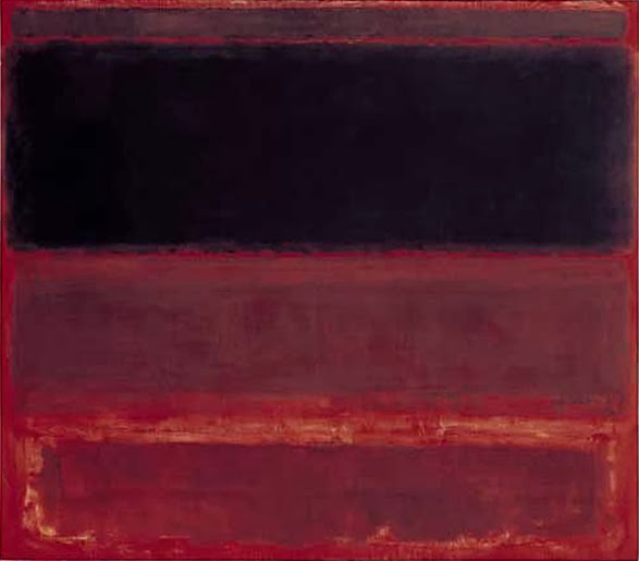
Hans de Bruijn / Mark Rothko


Mark Rothko
Four Darks in Red
1958
oil on canvas
259 × 295 cm
Whitney Museum of American Art, New York


Hans de Bruijn recognises the romantic artist’s attitude - painterly recreating a sublime perception in the paintings of Mark Rothko (1903-1970). He assigns a deep methaphysical dimension in his paintings by his very specific use of paint and color.
De Bruijn paints him after a photograph of the artist in his studio. Rothko’s monochrome composition is translated into air, water and beach. By the version from Hans de Bruijn, “Black on off-white and black and brownish grey” we see the dark figure of the artist trois quart from behind, as it where in conversation with space, and follow the direction in which he is looking. This image does make use of the “C.D. Friedrich effect”, leading the spectator into space of thick paint of subdued color clouds - melancholic contemplation.

Jetteke Bolten-Rempt, 2011


Hans de Bruijn (NL)
Black on off-white and black and brownish grey
2008
oil on canvas
200 x 150 cm