Saturday, 26 February 2022

Guus Koenraads / Paul Panhuysen


Paul Panhuysen

TWO FAMILIES OF 64 SQUARES

1991 

wood print on rice paper

4 prints size: 96 x 384 cm

Museum De Wieger Deurne, The Netherlands


Paul Panhuysen

LIGGEND IN HET GRAS

1995 

screen print on cotton on hardboard

292,50 x 292,50 cm

compositie work: 9 panels of 97,50 x 97,50 cm

photo Pieter Boersma


Paul Panhuysen

QUEL OISEAU SUIS-JE (WHAT BIRD AM I?)

2009 

installation with 40 canaries in 2 opposite aviaries, programmed chip recorders (bird sounds) song and contact microphones: a concert space for 2 months for the birds and visitors of the church.

Biennale internationale d’art contemporaine de Melle

Church St.Pierre Melle, France


Paul Panhuysen

2013

installation view Locus Solus Antwerpen, Belgium


There are several artists who I appreciate and respect, both for who they are and for their work. What I've never had, however, is a particular idol, or the urge to idolize or glorify anybody. 

It has been seven years since Paul Panhuysen (Maastricht, August 21, 1934  Eindhoven, January 29, 2015) passed away. Thanks to his wife Hélène Panhuysen-Hulshof, I was able to maintain contact with him until the very end.


I got to know Paul in the early eighties in Het Apollohuis in Eindhoven. As we got to know each other better, our conversations gained in depth. We used to cover a variety of topics: visual art, architecture, urban planning, public space, but also life itself. These conversations have made me a much richer and more conscious person. 


We had several things in common. Working in urban planning teams and advisory committees for authorities on different levels, in the field of public space, public greenery and the micro-detailing of spaces where people live and work. What we also had in common was being teachers, and a deep love of nature. Paul was very knowledgeable about birds. Not only did he make them participate in his sound installations and his recordings, but he could actually communicate with birds. 

Due to the aforementioned activities, whether or not in paid employment, as an artist I have been able to earn a living until now so that I can work in complete freedom.


What I find special about Paul Panhuysen is the ease with which he moves between and within different disciplines in the visual arts: performance, sound installations, photography, graphic work, painting, drawing and making sculptures. I worked for and with him, setting up many exhibitions and constructing spatial installations. Through this collaborative work I learned a lot from him, such as the notion that there is no distinction between main and side issues - everything matters! For instance, the knots tied in the cords that fastened the strings of his long string installations were all the same. 


Paul taught me to trust myself concerning my artistry, my intuition and my qualities as a person.
As an artist I mainly concentrate on painting. In the early eighties I made expressive paintings, built up in grisailles. I sometimes produced several large works in a day. I was convinced I had to do that, otherwise I wouldn't be a real artist. During a residency at the HDK and in Ku
̈nstlerhaus Bethanien in Berlin (1986-1987), my work became simpler and quieter, both in structure and content.


By taking my time and working from a more relaxed approach, I get a better insight in what I do and eventually a strictly personal touch disappears in my work. My paintings are abstract, composed of horizontal and vertical lines and surfaces, applied in even layers. The thickness of these layers sometimes creates a relief. I don’t use diagonal lines to create perspective.


Since then my development in painting has been in small steps, and my output is small. Not because I don't work enough, but I often paint over parts, or even obliterate an entire work by painting it over. Consequently paintings do not pile up in my studio. I no longer wonder whether my talent will ever be proven. There are more important things that I want to turn my attention to. Researching the contrast between color and no color, between line and plane, between thin and thickness, small and large, wall and floor, and so on, I can walk this path for years to come. In the meantime, nature has become my greatest friend. I spend a lot of time there in my long-distance walks, sometimes musing about missing the artist and my friend Paul Panhuysen. 


Guus Koenraads, 2022


Guus Koenraads  

JACOBSLADDER

2021

acrylic paint on canvas/panel

36 x 9 x 3 cm

photo Huig Bartels


Guus Koenraads

REFUGE

2021 
brass 
24 x 30 x 0,3 cm 
photo Huig Bartels


Guus Koenraads (NL)

SPECIES OF SPACES

2018 
acrylic paint on wood 
15 x 30 x 10 cm 
photo Huig Bartels


Saturday, 12 February 2022

Cas van Deurssen / Cy Twombly


Cy Twombly

Triumph of Galatea

1961

oil, crayon, pencil on canvas

294,3 x 483,5 cm  


Cy Twombly

Untitled (Notes from a Tower)

1961

pencil drawing, wax chalks and colour pen

33,2 x 35,5 cm


I recall seeing Cy Twombly’s work for the first time. It was during the first year of the academy when an old teacher of mine showed us a book that contained Twombly's work. He held it up in the air and mentioned that most of us will probably dislike it at first, but that we will love it the moment we graduate. For me, this was not the case. 

There was something intriguing about that book. Something so far fetched regarding my ideas of what I considered art at that moment, but still I was sold. The more I looked at it, the more curious I became. 


The works created in the 1960’s caught my attention in particular. Large scale paintings and drawings mainly consisting of smudges, scribbles, texts, somewhat recognisable shapes, and various symbols. 


The works from this era arise from various classical themes, myths, poems and to me most reflect Twombly’s background as a cryptologist. Somehow these works look rushed, but exude a sense of calm. The rhythmic compositions feel bound together by dirty graffiti-like gestures contrasting cryptic figures that have the ability to shift meaning and prompt curiosity. The way Twombly transforms his sources into his own visual language is what I feel related to as an artist. An inspiration that sometimes fades away but will always find a way back to make a fresh appearance.


Cas van Deurssen, 2022


Cas van Deurssen

Melkruimte-plus

2020
oilpaint, acrylic, spraypaint, silicon, collage on canvas

235 x 190 cm


Cas van Deurssen (NL)

Apollo Hotel

2021

Acrylic, spraypaint, airbrush, silicon, collage on canvas

(3x) 235 x 190 cm

www.casvandeurssen.com


Friday, 28 January 2022

Stéphanie Leblon / Berthe Morisot


Berthe Morisot 

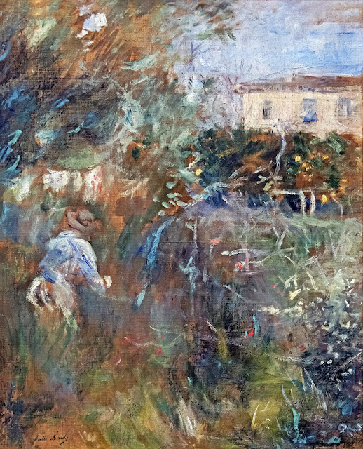
Femme au jardin (Villa Arnulphi à Nice)

1882

oil on canvas

56 x 33 cm

Bemberg Fondation Toulouse


I saw Berthe Morisot's painting in the Bemberg Fondation in Toulouse. I was deeply impressed by the work.

The painting is a fresh work, powerfully painted with a surprising brushstroke.

The white fresh lines that are placed on the work give the work its own movement and depth. 

Both movement and depth are two key concepts in my own artistic trajectory, also use of white occupies a central place.


Stéphanie Leblon, 2022


Stéphanie Leblon

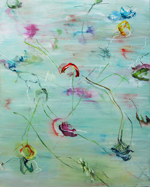
Pompom Honeycombs #1 

2019 

oil on canvas 

140 x 180 cm


Stéphanie Leblon

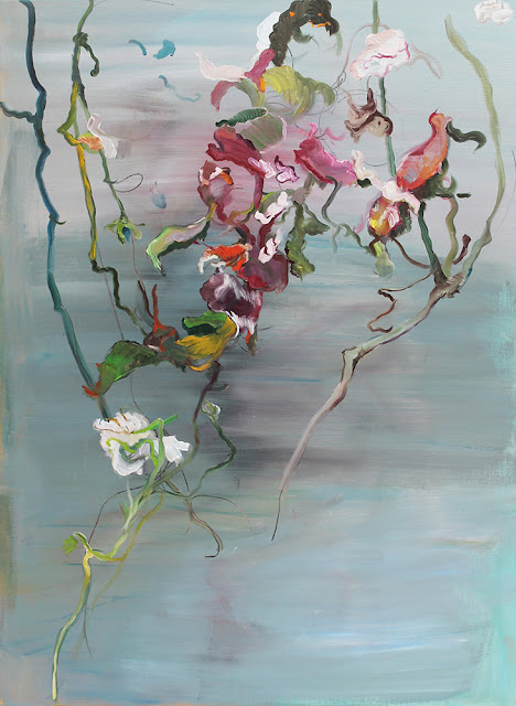
Ceasing Presence #8 

2018 

oil on canvas 

110 x 150 cm


Stéphanie Leblon (BE)

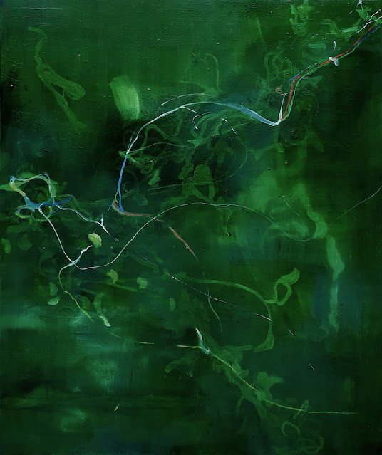
Green Connection 

2020 

oil on canvas 

140 x 180 cm

www.leblon.be


Saturday, 15 January 2022

Greet Billet / John McCracken


John McCracken

Wave

2004
polyester resin, plywood, fiberglass

243,8 x 76,2 x 40,6 cm

courtesy: unknown
photo: unknown


Electron transitions: John McCracken

When atoms are heated enough, the energy level of the electrons changes. When they go back to their previous energy level, it is called electron transitions. During this transition, photons are released that we observe as light. If this light falls on an object, we can see this object through the reflection of the light on it. There are different types of reflection, such as the targeted and the diffuse reflection. These species are important in applications for matte paint or lacquer paint.


“I think of color as being the structural material I use to build the forms I am interested in. The fact that in another sense I use plywood, fiberglass and lacquer as structural materials is of less importance. I have found that a certain combination of color intensity and transparency and surface finish provide me with the expressive means I way, at least for the present”

Neville Wakefield. John McCracken: Sketchbook. Santa Fe: Radius Books, 2008: p. 66.


John McCracken (1934 - 2011) was an American artist who lived and worked in Los Angeles, Santa Fe, New Mexico and New York. After high school, he first went to the army for four years and then studied at the California College of Arts and Crafts. In 1965 McCracken moved from Oakland to Los Angeles because the artistic landscape suited him better than in California. Before that period McCracken made oil paintings. He evolved into combinations of oil paintings with plywood and car paint, ultimately to end up with full-fledged sculptures in plywood and car paint.


“California culture did of itself offer some inspiration for art, too. The style of the place was sort of willy-nilly creativity. And the cars, with their sometimes attractive finishes, was one thing I looked at. The car-finish materials were what I was using and learning to use for my work...Not that many of them had great finishes – but the light in Los Angeles does something, too, and anyway there were some ‘inspiring’ glints of things here and there in Los Angeles that I was able to bounce off of in my track toward making what I felt in my intuitions was possible.”

Rachel Rivenc. Made in Los Angeles: Materials, Processes, and the Birth of West Coast Minimalism. Los Angeles: Getty Conservation Institute, 2016: p. 96.


In 1968 McCracken moves to New York and meets, among others, Flavin, Donald Judd, Carl Andre and Barnett Newman. When McCracken leaves New York, attention for him fades for a while, but in the 1980s, renewed interest comes from the art world for his work. From then on McCracken is investigating how he can use different materials for his work and also pays more attention to the architectural context where his work will be exhibited.


I chose his work 'Wave' (2004). This work consists of a rectangular plinth, a base in plywood treated with polyester resin and black pigment. McCracken has several works like this black beam, and there are also similar sculptures with other pigments and polyester resin as well as pedestals in polished metal. The shape of this sculpture is a beam, a purified minimalist form. For McCracken this form represents human proportions. But this form, the rectangle or plinth, is actually the bearer of the real work, namely the colour that this plinth has been given - in this case a deep black. The extremely thorough technique of processing the black pigment and polyester resin on the surface actually determines the entire work. Like a real pedestal, the work therefore fully supports this intensive colour treatment. The black pigment and the polyester resin have been made and applied with such skill and expertise that a certain depth has been created in the colour layer, making this colour seem elusive. This is reinforced by the high gloss obtained during the processing of the polyester resin. 


Partly because of this high gloss, the work reflects its surroundings, so that the colour seems to merge into the surroundings and vice versa. The minimalist form, the depth in the layer of colour and the reflective character give this work an unreal and inviolable quality. The work seems to merge into its surroundings and the surroundings seem to merge into the work. This is possibly reinforced when several copies are placed in a room, as during the exhibition at David Zwirner in New York in 2006. Due to the repetition or doubling of the works and the penetrating and reflective nature of the surface, as a viewer you lose your focus. Because of the intense black reflection, the environment seems to continue behind the mirror and there is a suggestion of another environment in the deep black. If only Alice could have seen this!


Greet Billet (BE)

RGB and three mirrors 

2015
MDF, plexiglass, mirrors, wall paint, 2 x (112 x 150 x 112) cm 

installation view: Gallery El Welle

courtesy of the artist

photo: Kristien Daem


This work consists of a pedestal in MDF with three plexiglas plates on it, first a blue one, on top of that a green one and at the very top a red one. These plexiglas plates refer to the additive colour system. The sheets are originally transparent, but as they lie on top of each other, they lose their transparency and their colours are mixed in a certain way. When the sheets are placed on top of each other in a different order, a different colour is obtained. The difference in colour also depends on the thickness of the sheets. In this order and thickness, the result is an indeterminate deep brown or deep black colour. Due to the mirroring effect of the sheets, the environmental colour of the exhibition space is also absorbed into the work, so that the colour depends on the place where the work is exhibited. 


The dimensions of the plates are 112 x 150 cm. The dimensions of the pedestal correspond to this in order to pursue a certain peace and harmony. For this exhibition, the pedestal was painted white with the same paint used for the walls of the gallery. In this way, the pedestal becomes part of the architecture. In John McCracken's case, the pedestal is completely covered by the deep black colour, making the colour completely dominant. As a spectator, you drown, as it were, in the deep black. In my work, the confrontation between the colour and the spectator is more subtle than in John McCracken's. In this case, the plinth merely lifts the deep colour and only the top of the gallery is reflected. The viewer is not initially reflected, as is the case with McCracken's pedestals. Only when he bends over the work he will see himself.


The materiality of the colour, obtained through an excellent technique in John McCracken's work, is inimitable. By sanding layer after layer with great intensity and by manipulating the black surface in such a way, McCracken manipulates the light in a very exceptional way. In my work, I want to let the light manipulate itself by offering it a certain material that is unprocessed. In this way I hope to give the viewer the purest possible view of the light itself. 


Greet Billet, sections of the PhD 'Light as an artistic medium'

www.greetbillet.be


Sunday, 26 December 2021

Bram Braam / Gordon Matta-Clark


Gordon Matta-Clark
Bingo 
1974

painted wood, metal, plaster and glass, three sections

175,3 x 77,.8 x 25,4 cm

collection MoMA


Gordon Matta-Clark

Conical Intersect

1975

27-29 Rue Beaubourg, Paris


Still a huge influence for many young artists interested and dealing with topics related to architecture and space in our urban environment is Gordon Matta-Clark. Unfortunately he died way too young in 1978 when he was only 35. His radical approach to look beyond the limits of sculpture and 50 years after Duchamp’s ready-made “fountain” he declared our buildings, architecture and city spaces as his main artistic play field. Buildings, stairs, windows and floors became the main subject of the art itself, a building as a sculpture, splitting houses, cutting holes through the building, floors and walls. Sometimes he showed the elements he took out of the building and showed it in the museum, but mostly the building itself was the art work what was only visible for a short moment till the building was demolished. By making holes, you could look through the whole structure of the architecture and showing in his words “the heart of the building”


His way how to look for the limits of sculpture in our daily environment can be seen similarly in my own work, although differently. My works look like real fragments taken out of our landscapes but are in fact well thought in balanced constructed sculptural works. I play with the tension between reality and abstraction and dealing with the question: where am I looking at, is it real, is it staged, is it reconstructed or a mixture of all these things, questions to be made more than ever in our accelerated time. 


The massive influence by Gordon Matta-Clark can be seen back in all of my works but specific in my use of materials and ambition to look differently to our daily reality. A wall as a painting, a building as a sculpture, a landscape as the art work.


Bram Braam, 2021


Bram Braam

exhibition view 'Cycle', Bram Braam & Anneke Eussen

PARK, Tilburg (NL)

2020


Bram Braam

The flow of present 

2020

200 x 220 cm


Bram Braam (NL/DE)

Outgrowth

2021

steel, tiles, wood, posters

100 × 58 × 38 cm

brambraam.com